Boxplots
Date: February 21st 2016
Last updated: February 21st 2016
Import modules
import matplotlib.pyplot as plt
import numpy as np
Create data
d1 = np.random.rand(25) * 35
d2 = np.random.rand(30) * 25
d3 = np.random.rand(15) * 10
data = [d1, d2, d3]
Example 1: Basic boxplot: default
plt.figure()
plt.boxplot(data)
plt.show()
Example 1: Default output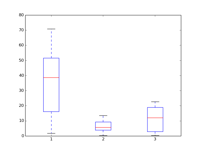
Example 2: Add more detail to boxplot
# note the change in calling plt to plt.subplots()
fig, ax = plt.subplots()
bp = ax.boxplot(data, sym='k+')

# axis labels
ax.set_xlabel('treatment')
ax.set_ylabel('response')

# change line style of whiskers and terminal cross hairs
plt.setp(bp['whiskers'], color='k', linestyle='-')
plt.setp(bp['fliers'], markersize=3.0)

# add tick labels
plt.xticks([1, 2, 3], ['data1', 'data2', 'data3'])
plt.show()
Example 2: output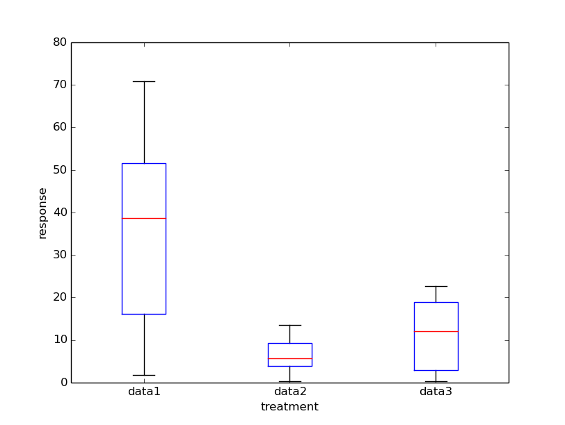
Example 3: boxplot of 2 factors for 3 treatments
# This example is adapted from a response given here: http://stackoverflow.com/questions/16592222/matplotlib-group-boxplots

# function to create data
def make_data(n_samples, max_multiplier, n_treatments):
    data_list = []
    for i in range(n_treatments):
        multiplier = np.random.rand(1) * max_multiplier
        a_list = np.random.rand(n_samples) * multiplier
        data_list.append(a_list)
    return data_list

# get the max value for setting y axis
# loop over arguments given to function
# then, loop over the lists in an array
# then, loop through numbers in the list
def get_max_value(*args):
    value = 0
    for arg in args:
        for list in arg:
            for number in list:
                if number >= value:
                    value = number
    value *= 1.1
    return value

# function to set color of each box
def set_box_color(bp, color):
    plt.setp(bp['boxes'], color=color)
    plt.setp(bp['whiskers'], color=color)
    plt.setp(bp['caps'], color=color)
    plt.setp(bp['medians'], color=color)

# create figure
plt.figure()

# create data
data_a = make_data(50, 100, 3)
data_b = make_data(50, 80, 3)

# get y max (+10%)
y_max = get_max_value(data_a, data_b)

# create boxes
bpl = plt.boxplot(data_a, positions=np.array(range(len(data_a)))*2.0-0.4, sym='', widths=0.6)
bpr = plt.boxplot(data_b, positions=np.array(range(len(data_b)))*2.0+0.4, sym='', widths=0.6)
set_box_color(bpl, '#D7191C') #colors are from http://colorbrewer2.org/
set_box_color(bpr, '#2C7BB6')

# create a legend
plt.plot([], c='#D7191C', label='Group1')
plt.plot([], c='#2C7BB6', label='Group2')
plt.legend()

# tick labels
ticks = ['data1', 'data2', 'data3']
plt.xticks(range(0, len(ticks) * 2, 2), ticks)
plt.xlim(-2, len(ticks)*2)
plt.ylim(0, y_max)

#plt.tight_layout()
plt.show()
Example 3: group boxplot output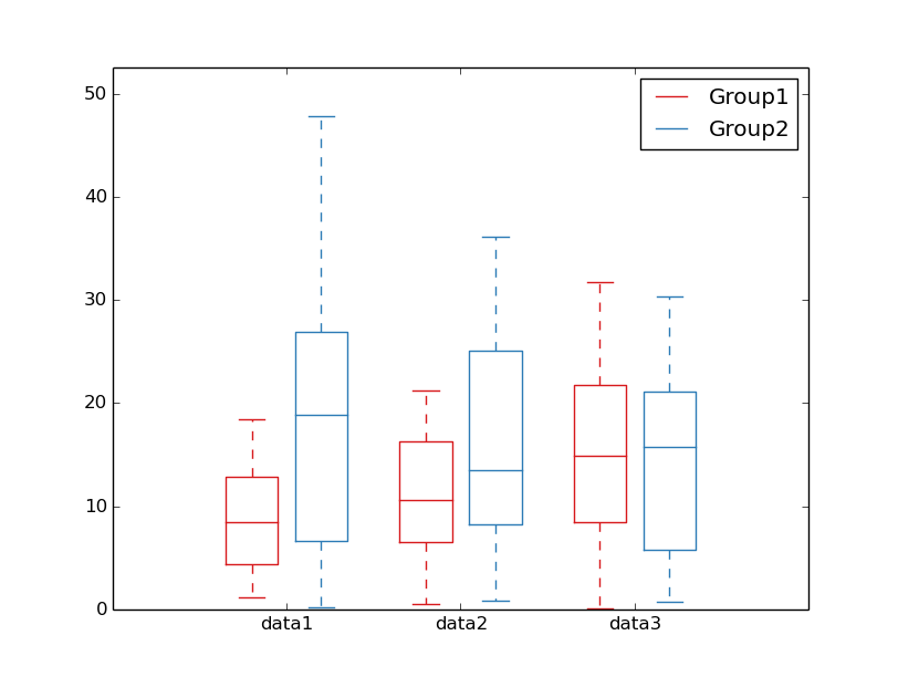
Example 4: complete figure with labels
# create figure
plt.figure()
# create data
...
# get y max (+10%)
...
# tick labels
...
# Create boxes
...
# set box color
...
# create a legend
...
# set ticks and axis limits
...

# main title
plt.suptitle('My example boxplot', fontsize=24)

# x and y labels
plt.xlabel('Treatment', fontsize=20)
plt.ylabel('Response', fontsize=20)

#plt.tight_layout()
plt.subplots_adjust(left=3, bottom=3, right=1, top=1, wspace=0, hspace=0)

plt.show()
Example 4: complete boxplot output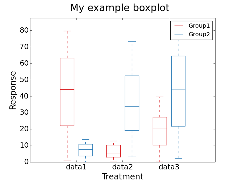
Useful resources