Scatterplot
Date: February 23rd 2016
Last updated: February 23rd 2016
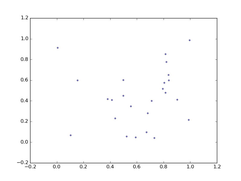
Basic example
import numpy as np
import matplotlib.pyplot as plt

x = np.random.rand(25)
y = np.random.rand(25)
plt.scatter(x, y, s=10, alpha=0.5)
plt.show()
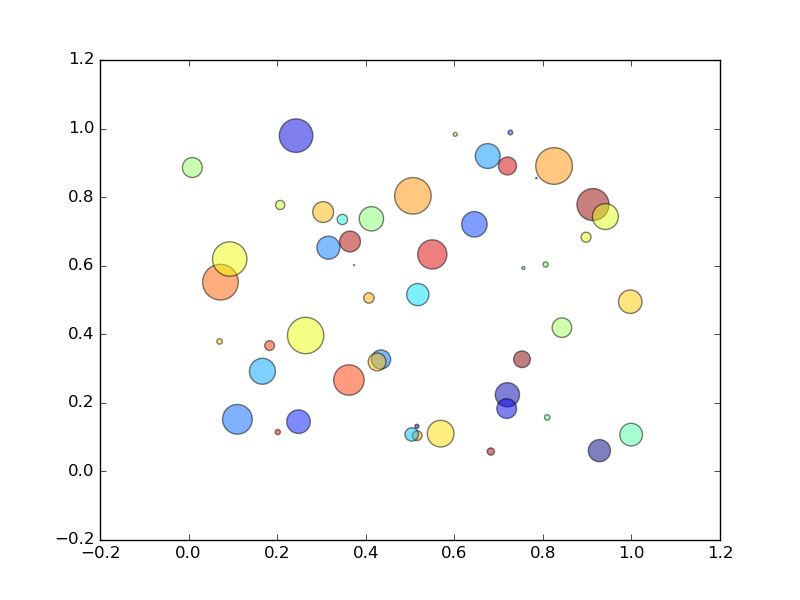
Random colors: example from this webpage
N = 50
x = np.random.rand(N)
y = np.random.rand(N)

# change color and size of points
colors = np.random.rand(N)
area = np.pi * (15 * np.random.rand(N))**2  # 0 to 15 point radiuses

plt.scatter(x, y, s=area, c=colors, alpha=0.5)
plt.show()
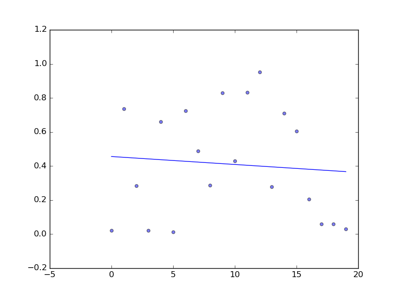
Scatterplot with a best fit line
#sample data
x = np.arange(20)
y = np.random.rand(20)

plt.scatter(x, y, s=20, alpha=0.5)
# use numpy's poly1d function...
plt.plot(x, np.poly1d(np.polyfit(x, y, 1))(x))
plt.show()
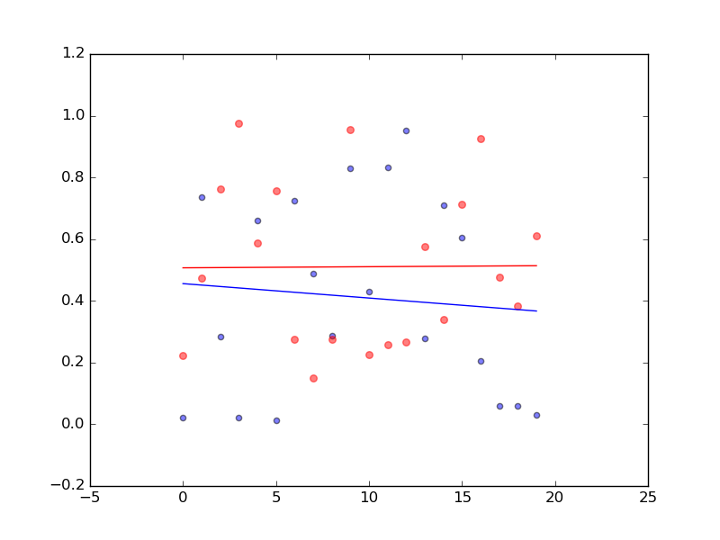
Scatterplot with two datasets (same x and y axis)
#dataset1
x = np.arange(20)
y = np.random.rand(20)

#dataset2
a = np.arange(20)
b = np.random.rand(20)

plt.scatter(x, y, s=20, alpha=0.5)
plt.scatter(a, b, s=30, alpha=0.5, color="red")

# use numpy's poly1d function...
plt.plot(x, np.poly1d(np.polyfit(x, y, 1))(x))
plt.plot(a, np.poly1d(np.polyfit(a, b, 1))(a), color="red")
plt.show()
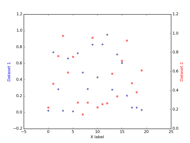
Scatterplot with two Y axis (same x, different y)
#using datasets from the last example
fig, ax1 = plt.subplots()

# Dataset 1
ax1.scatter(x, y, s=20, alpha=0.5)
ax1.set_xlabel('X label')
ax1.set_ylabel('Dataset 1', color='blue')

# Dataset 2
# make the second dataset independent by making a twin copy of x axis
ax2 = ax1.twinx()
ax2.scatter(a, b, s=30, alpha=0.5, color="red")
ax2.set_ylabel('Dataset 2', color='red')
plt.show()

# Note the difference in scale along the Y axis