Timeseries using pandas
Date: March 1st 2016
Last updated: March 1st 2016
Most of this code is just using pandas to organise time data for plotting. An interesting aspect of this approach is how df.ix[].plot() is used in the last step for plotting time versus sales. I found this example at: http://www.dummies.com/how-to/content/how-to-use-python-to-plot-time-series-for-data-sci.html.
Import modules
import datetime as dt
import pandas as pd
import matplotlib.pyplot as plt
import numpy as np
Create empty dataframe
#This dataframe will eventually hold the data we want to plot
df = pd.DataFrame(columns=(‘Time’, ‘Sales’))
df
#Empty DataFrame
#Columns: [Time, Sales]
#Index: []
Create data range
start_date = dt.datetime(2015, 7,1)
end_date = dt.datetime(2015, 7,10)
daterange = pd.date_range(start_date, end_date)
daterange
#DatetimeIndex(['2015-07-01', '2015-07-02', '2015-07-03', '2015-07-04',
#               '2015-07-05', '2015-07-06', '2015-07-07', '2015-07-08',
#               '2015-07-09', '2015-07-10'],
#              dtype='datetime64[ns]', freq='D')
Create data for each date
Append the data to the empty dataframe created above
for single_date in daterange:
    row = dict(zip(['Time', 'Sales'], [single_date, int(50*np.random.rand(1))]))
    # e.g. print(row)
    # {'Sales': 45, 'Time': Timestamp('2015-07-10 00:00:00', offset='D')}
    row_s = pd.Series(row)
    row_s.name = single_date.strftime('%b %d')
    # e.g. print(row_s.name)
    # Jul 01
    df = df.append(row_s)

df
#             Time  Sales
#Jul 01 2015-07-01     28
#Jul 02 2015-07-02     49
#Jul 03 2015-07-03      7
#Jul 04 2015-07-04     10
#Jul 05 2015-07-05     11
#Jul 06 2015-07-06      3
#Jul 07 2015-07-07     16
#Jul 08 2015-07-08     45
#Jul 09 2015-07-09     15
#Jul 10 2015-07-10     28
Plot the data
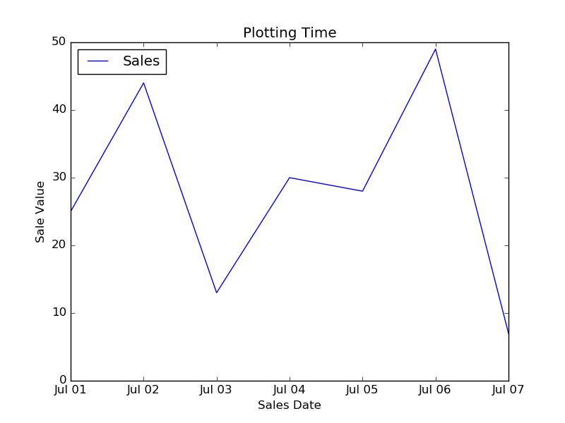
The row_s.name created in the previous step is used here for labels on the x axis.
# main plot
df.ix['Jul 01':'Jul 07', ['Time', 'Sales']].plot()

# e.g df.ix values
df.ix['Jul 01']
#Time     2015-07-01 00:00:00
#Sales                     25

# finish adding plot attributes
plt.ylim(0, 50)
plt.xlabel('Sales Date')
plt.ylabel('Sale Value')
plt.title('Plotting Time')
plt.show()
Output